UNICE
Re-architecting the information of a top-ranked overseas DTC site.

- Role
- Project Design Lead
- Timeline
- ~1 year
- Scope
- PC · Mobile Web · APP
- Year
- 2019 – 2020
Case at a glance
What it is, what was wrong, and what shipped — before the screenshots.
What this is
The project
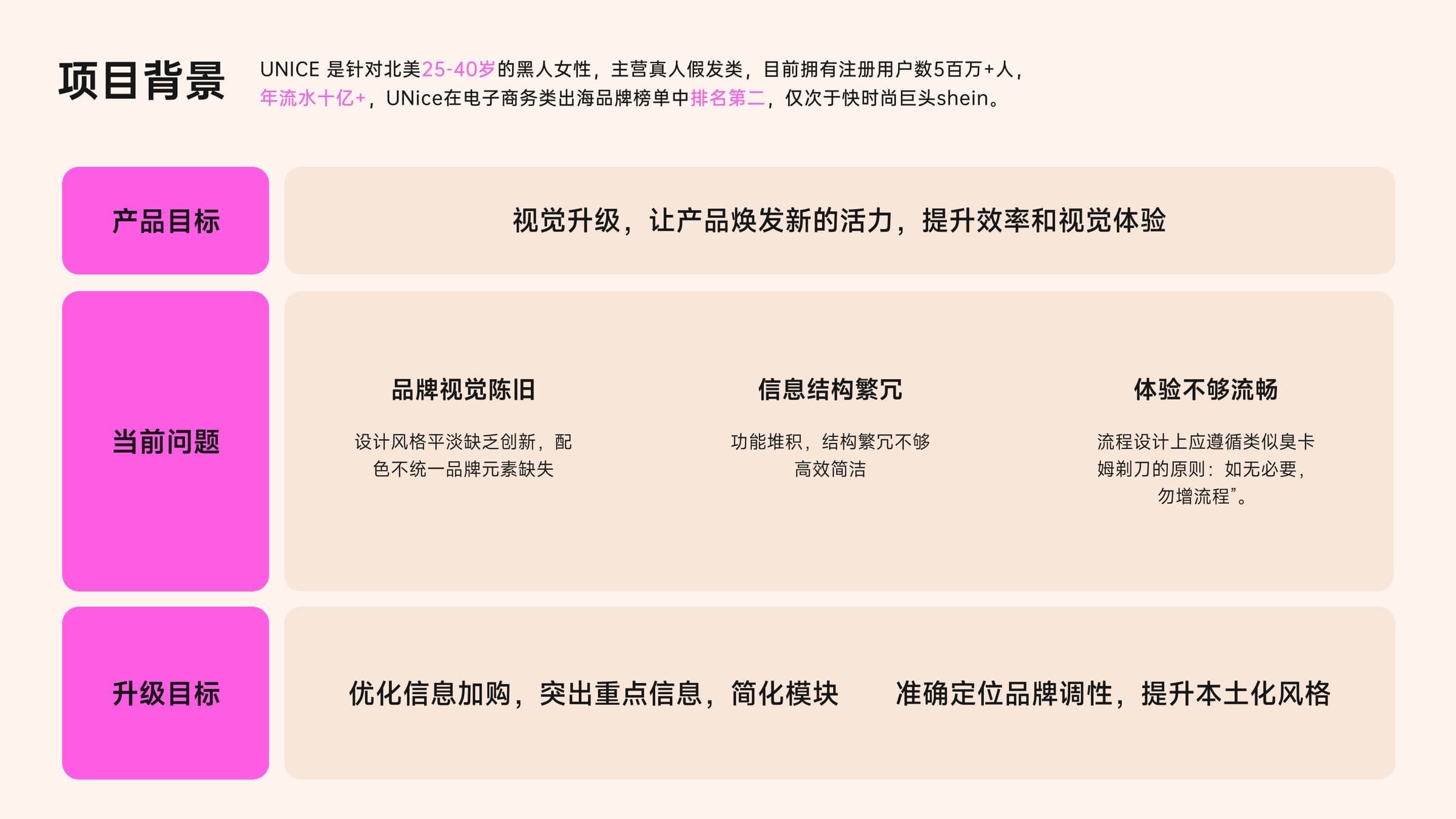
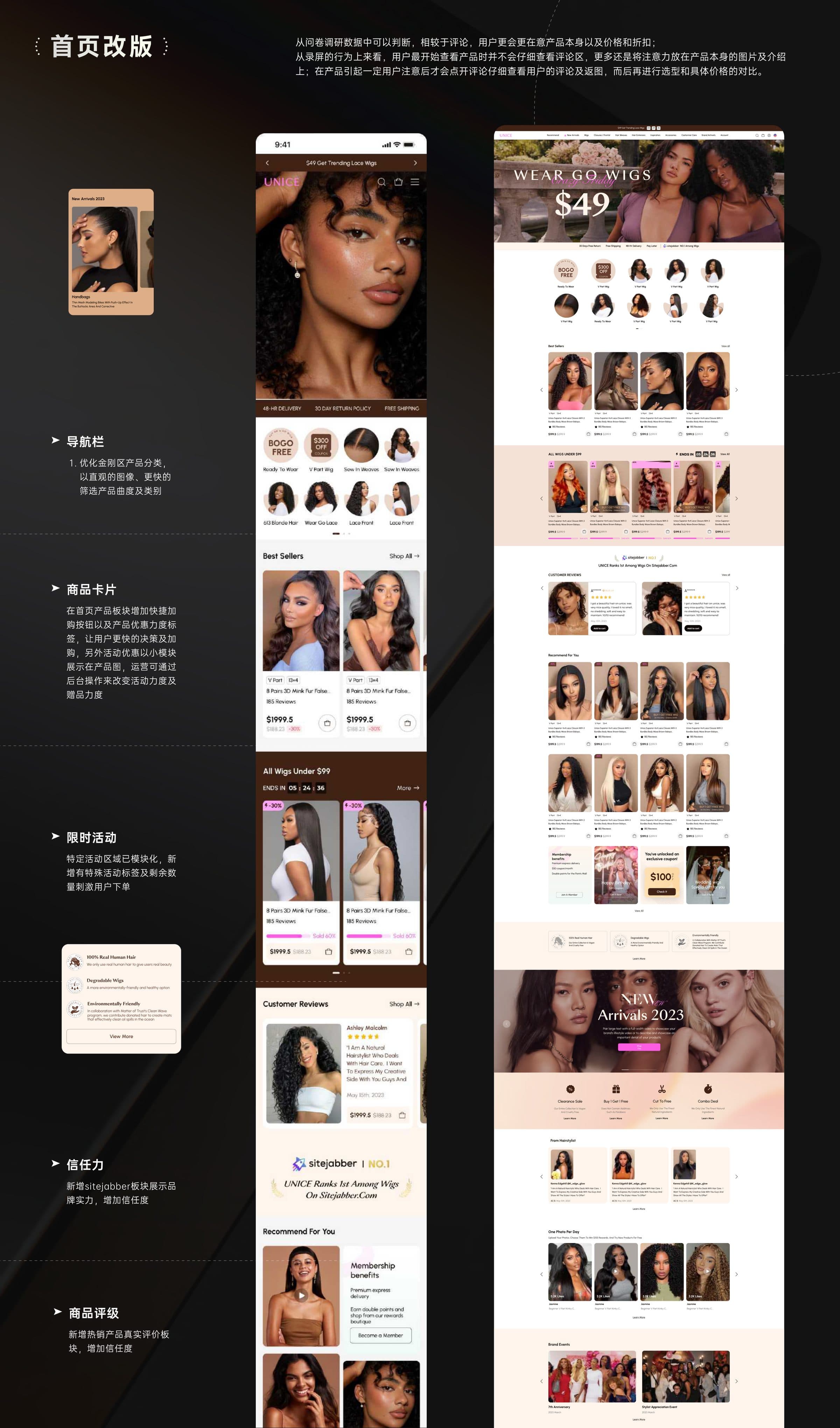
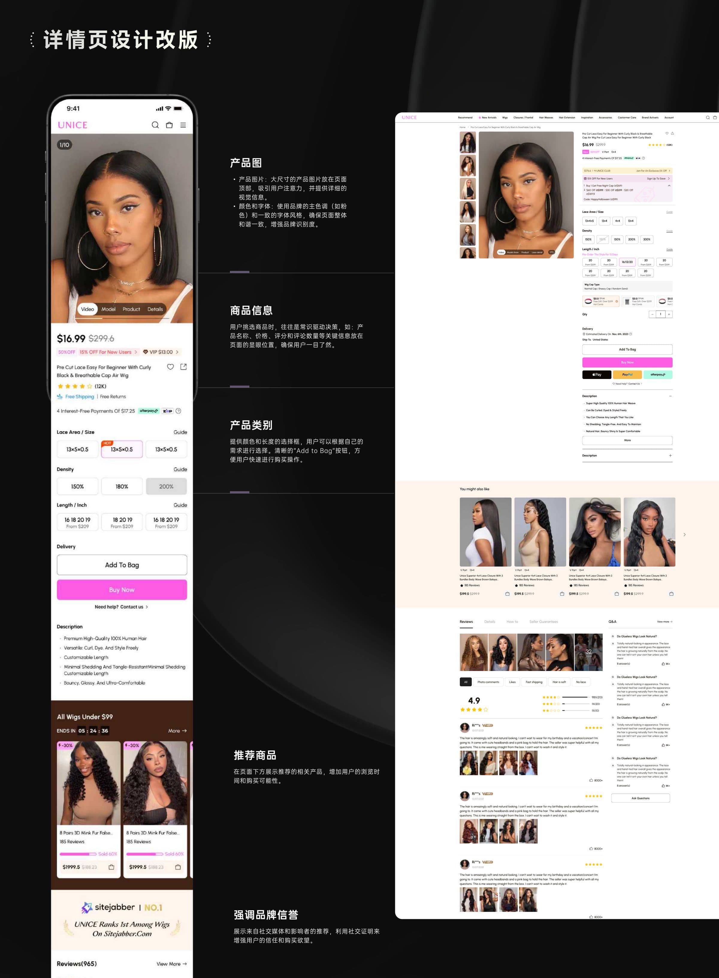
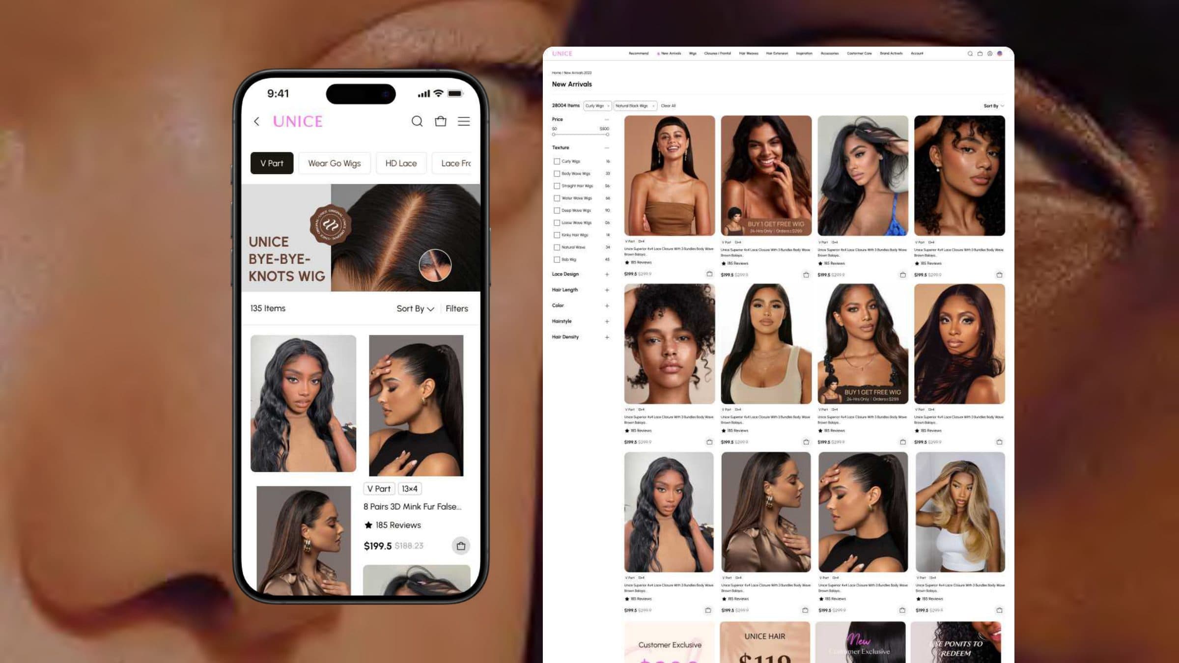
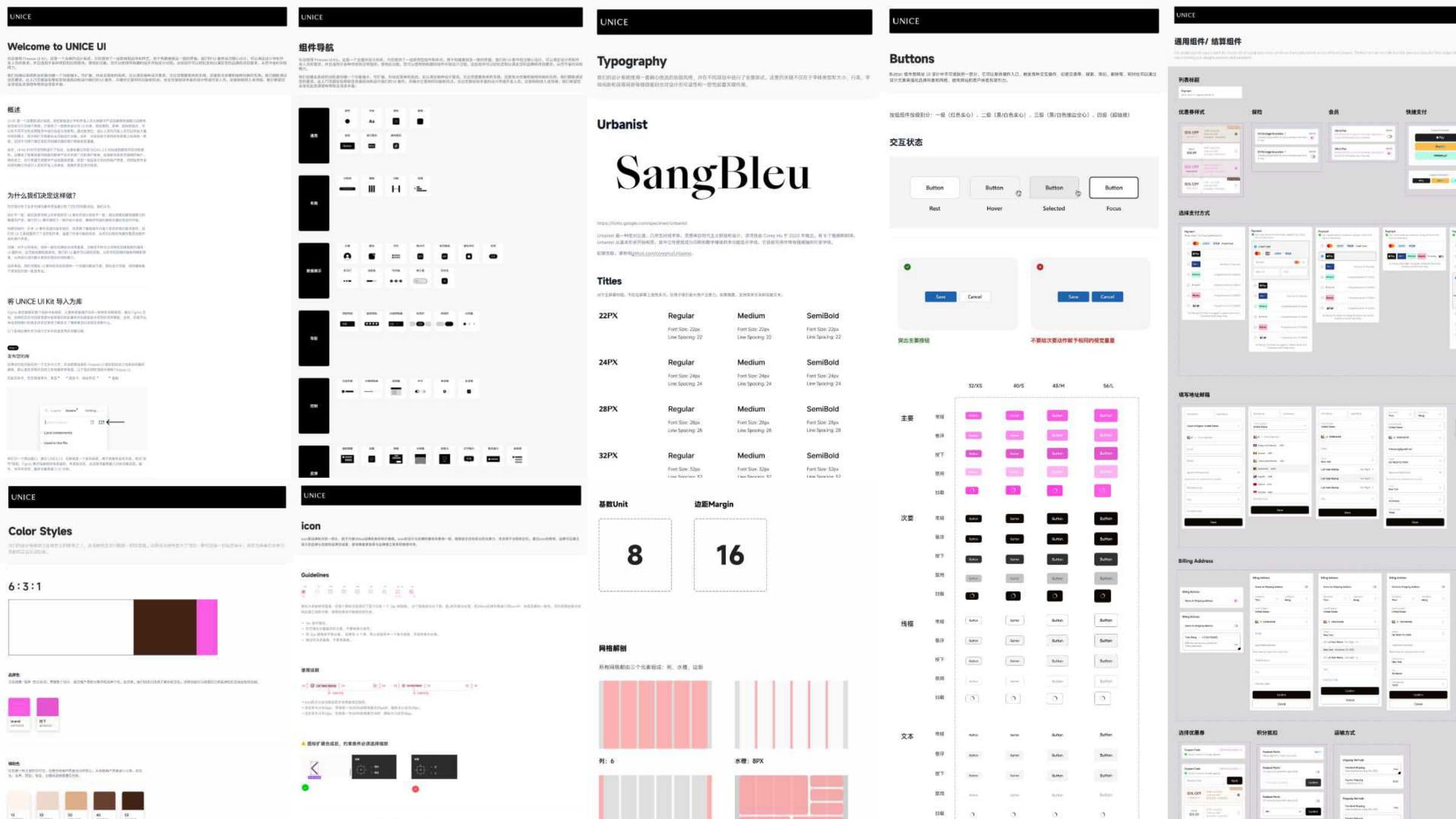
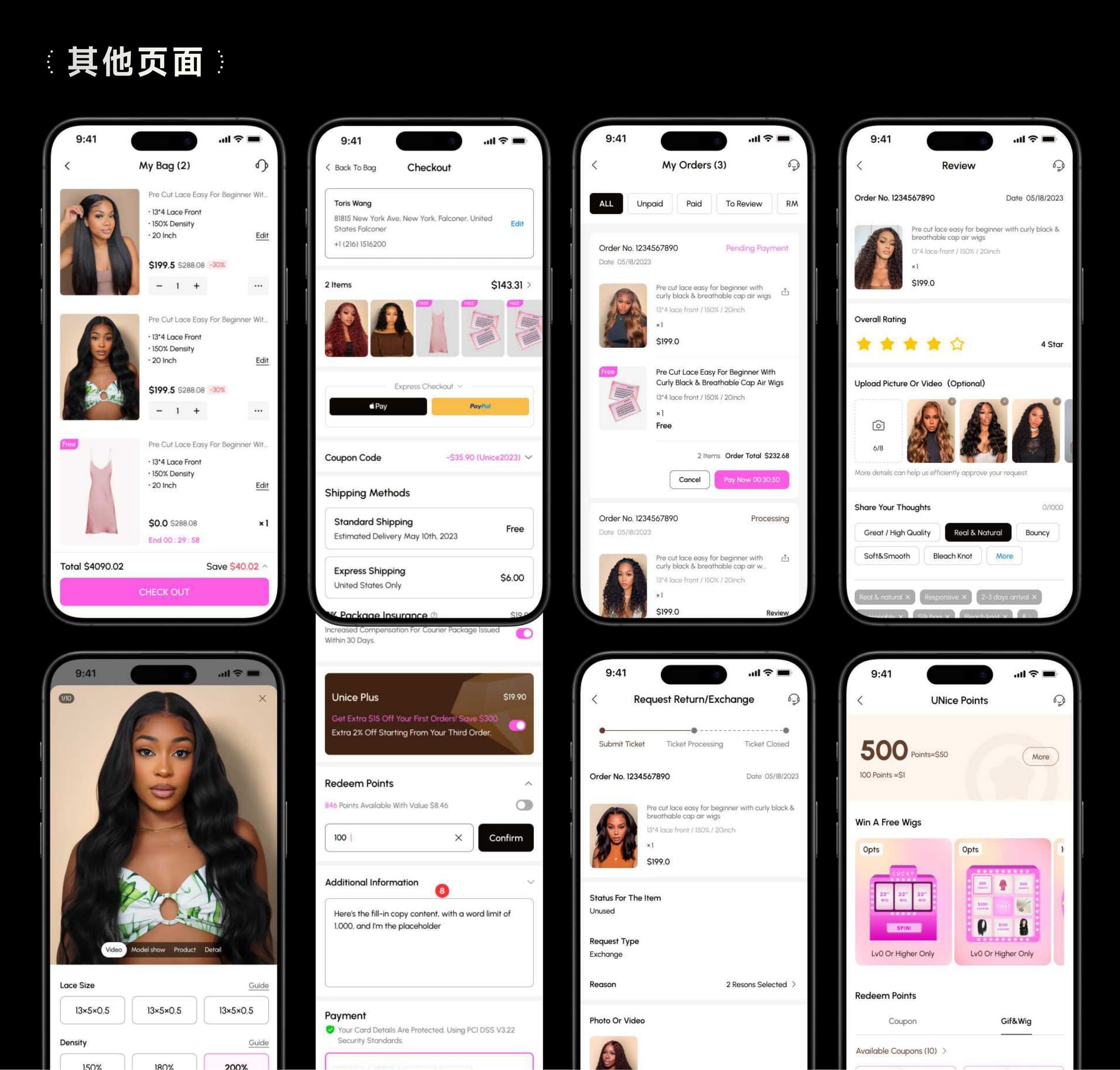
UNICE is a top-ranked overseas DTC wig brand (5M+ registered users, $1B+ revenue). I led the redesign across PC, mobile web, and app — focused on information architecture and a calmer, more premium surface that matched the product.
What was broken
The problem
The UI felt cheaper than the product: cluttered home, navigation that didn't match intent, and key trust and add-to-cart actions buried one click too deep.
What I did
The action
I rebuilt IA with an information-first hierarchy, refreshed visuals around localized references for the audience, and removed flow steps unless they earned their place — fewer modules on the happy path, louder signals where decisions happen.
Outcomes & evidence
+11.3%
Conversion on redesigned surfaces post-launch
E-com analytics — before/after on scoped page set.
+14.6%
Product image CTR after photography + layout work
PDP / listing modules — project documentation.
Narrative — 01
Background
UNICE is a leading overseas DTC wig brand for Black women aged 25–40 in North America, with 5M+ registered users and $1B+ annual revenue. At the time of the redesign UNICE ranked #2 among all overseas e-commerce brands leaving China, behind only Shein.
I led the cross-surface redesign — PC, Mobile web, and APP — focused on rebuilding the information architecture, sharpening the brand tone, and making the purchase path feel like a single product decision rather than a scavenger hunt.
Narrative — 02
Problem
A site at that scale usually has three interlocking issues, and UNICE had all three:
1. 【Stale brand visuals.】 The product was ahead of its UI — users perceived it as "cheap" where it was in fact premium. Design was actively subtracting from brand equity.
2. 【Over-stuffed information structure.】 Every business unit added its own modules over the years; the result was a homepage that felt like a trade show, not a storefront.
3. 【Flow friction.】 Navigation didn't match user intent; key affordances (add-to-cart, trust signals, promotion badges) were buried one click too deep.
Evidence
Screens, flows, and brand artifacts — the visual proof behind the narrative above.
01 — Context
A #2-ranked site that still felt #20
The context slide — scale vs. product polish. Every subsequent design decision came back to closing that gap.

02 — Homepage
One home, one promise
I restructured the homepage into a narrative rhythm — category identity, best sellers, limited-time band, trust wall, brand story, UGC. Each band answers one question users actually ask before they buy.

03 — Product detail page
PDP — decision-first, not feature-first
Large imagery, price + discount math in the first fold, Q&A near the fold-break, recommended picks at the base. Spec modules sit below the buy button, not above it.

04 — Category & other
Category · Collection · Membership
The cross-category surfaces — category browsing, thematic collections, and the member page — all built on the same component grammar so the site reads as a single product, not three.


Action
Key design moves
- 01
Localization before visual trend
The strongest signal in user research wasn't "modern" or "minimal"; it was "feels like it understands me". I pulled visual references from the audience's own cultural touchpoints — editorial covers, studio portraits, everyday styling — before looking at UI trends. The site had to feel like it belonged to its audience.
- 02
Remove features to expose the product
Every stakeholder argued for keeping their module on the homepage. I pushed back by making the cost of keeping something explicit: "What is this module preventing users from seeing?" That reframing made deletion a constructive move, not a political one.
- 03
Trust factors placed where doubt lives
Free shipping, verified reviews, third-party rating (Sitejabber #1 in wigs) — these were scattered across the footer and sidebar. I rebuilt them as inline components that appear right next to the action they support: price, add-to-cart, checkout. The same message, made visible at the moment it matters.
Results
What changed — and how design earned it.
01
User & business outcome
The redesign closed the gap between UNICE's actual position (top-tier brand at scale) and the feel of its interface (a busy marketplace). The site stopped working against itself — the product quality and the surface users interacted with finally told the same story.
02
How design delivered
An information-first hierarchy, localization-grounded visuals, and tightly disciplined flow removal turned the site from feature-stacked to decision-ready. Design became a conversion ally instead of a visibility bottleneck.
03
Leverage for the team
- 01
Post-launch conversion rate lifted 11.3% across the redesigned surfaces.
- 02
Product image CTR improved 14.6% after photography and layout revisions.
- 03
Delivered a cross-surface visual system spanning PC, Mobile web, and APP — making future campaign production measurably faster.
Narrative — Reflection
What this project leaves me with.
Working on an already-successful product teaches a different lesson than building from zero — the question stops being "what should we add?" and becomes "what is blocking what we already have?". I came out of UNICE convinced that at scale, subtraction is the highest-leverage design move available.
The other durable takeaway is the value of localization as a design principle, not just a translation step. The features were fine; the visual voice wasn't speaking the right language. A brand that already exists globally can only grow by sounding like the places it's actually in.